These designs seek to promote something so explicit in view that when you see it, you can understand all of the worst actions that someone can commit and not only against women. It's an explicit drawing yes, sometimes you may be uncomfortable seeing it if, but THAT is exactly the point. No one should ever be comfortable listening to stories of rapists or victims, or pretending that the problem doesn't exist.
The feeling is exactly discomfort because it is an act of evil and humiliation that any human being would like to go through. This was the first illustration of many, it was the inspiration to keep touching on both social issues and a bit of humor for women. Feminism is this, grow and be strong together men and women. Protect and love each other and give us the opportunity to move forward.

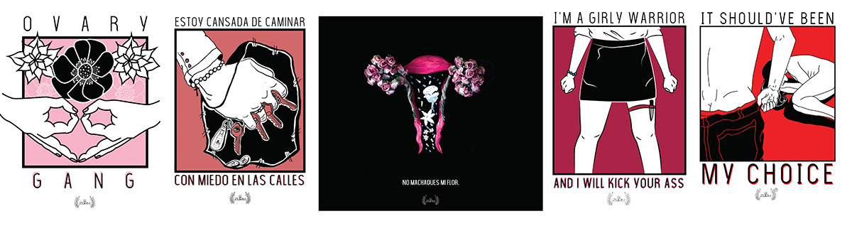
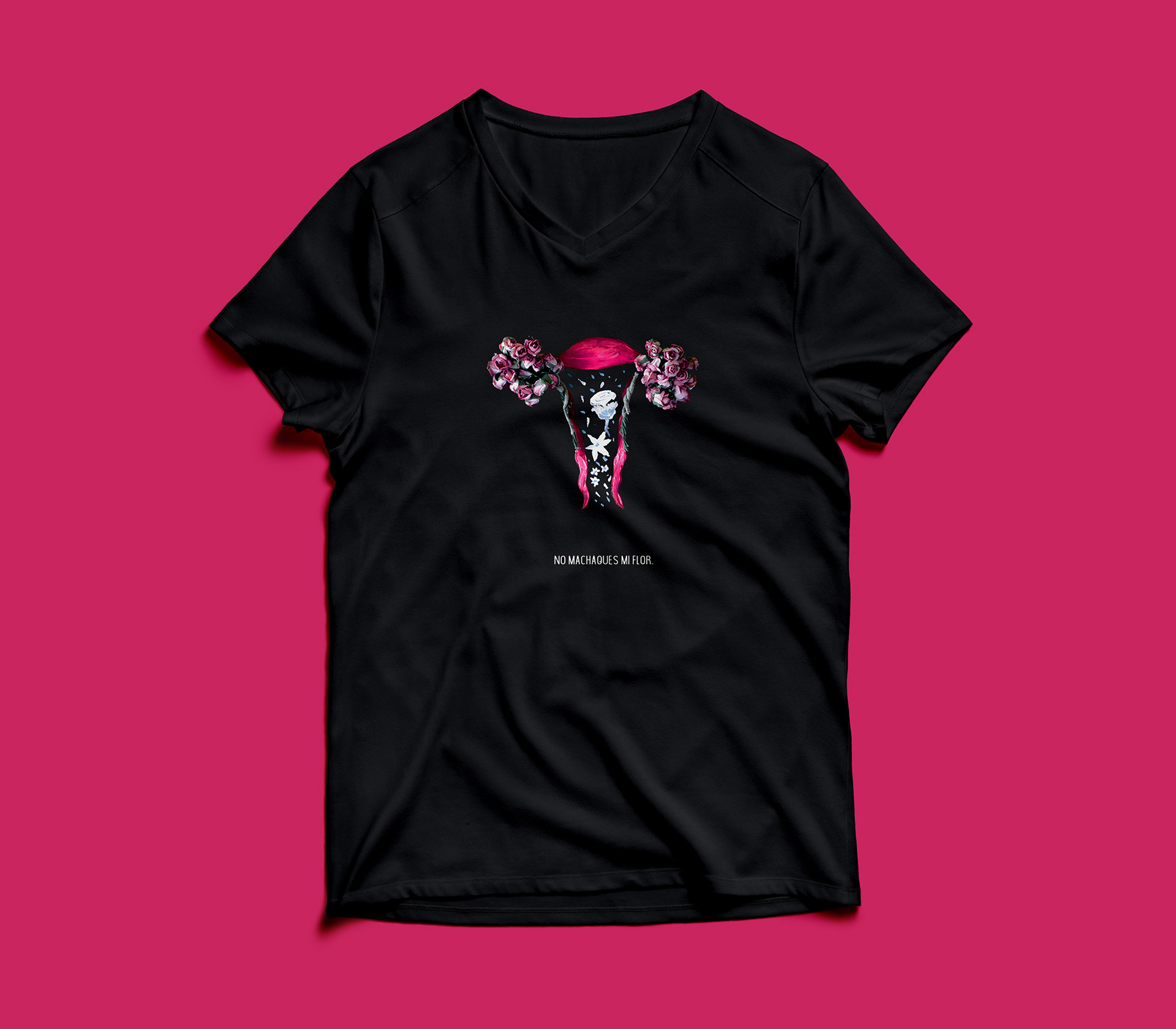
Do not crush my flower is the only t-shirt of the line worked through photography and image editing, this represents the virginity and fertility of a woman. Through the flowers it is understood that they are the ovaries, with their ovules. The image is worked with colored tempera. The colors used represent the color of the female reproductive system, the flowers illustrated within the matrix refer to female fertility.The copy "Do not crush my flower" can be understood as "do not destroy the fertility of a woman" or also as "do not take away the virginity of a woman".
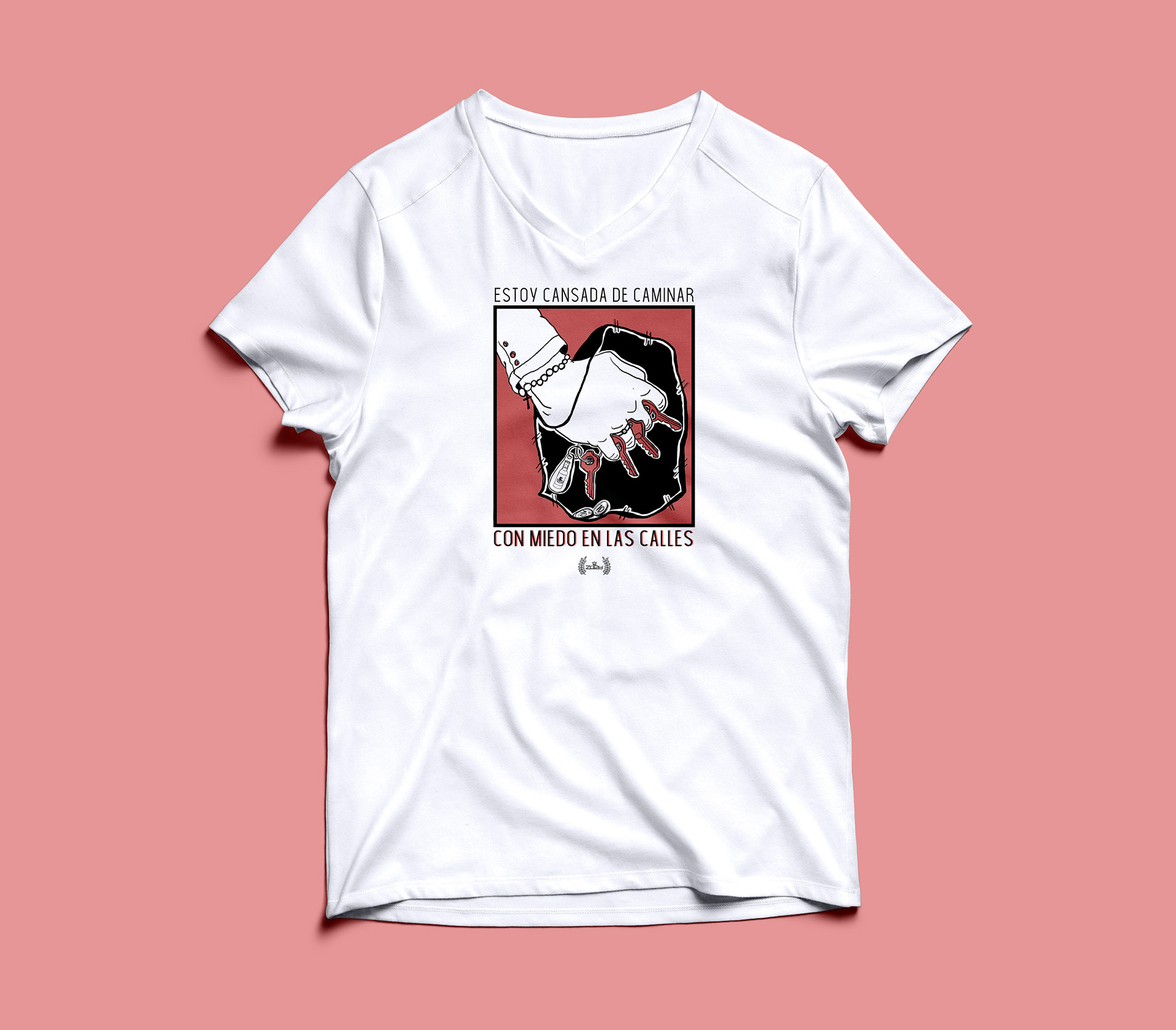
This illustration is based more on social problems that are suffered in the whole world. This specifically, tries to share in a certain way the reality that many women live daily when walking the streets, tries to reflect the level of alertness and stress with which they have to live day by day due to the insecurity in which you live.

Ovary Gang is an illustration that ultimately joins the feminine humor, representing the ovaries with hand signs. Ovary Gang tries to represent the female group, making women a strong and large group that supports each other.
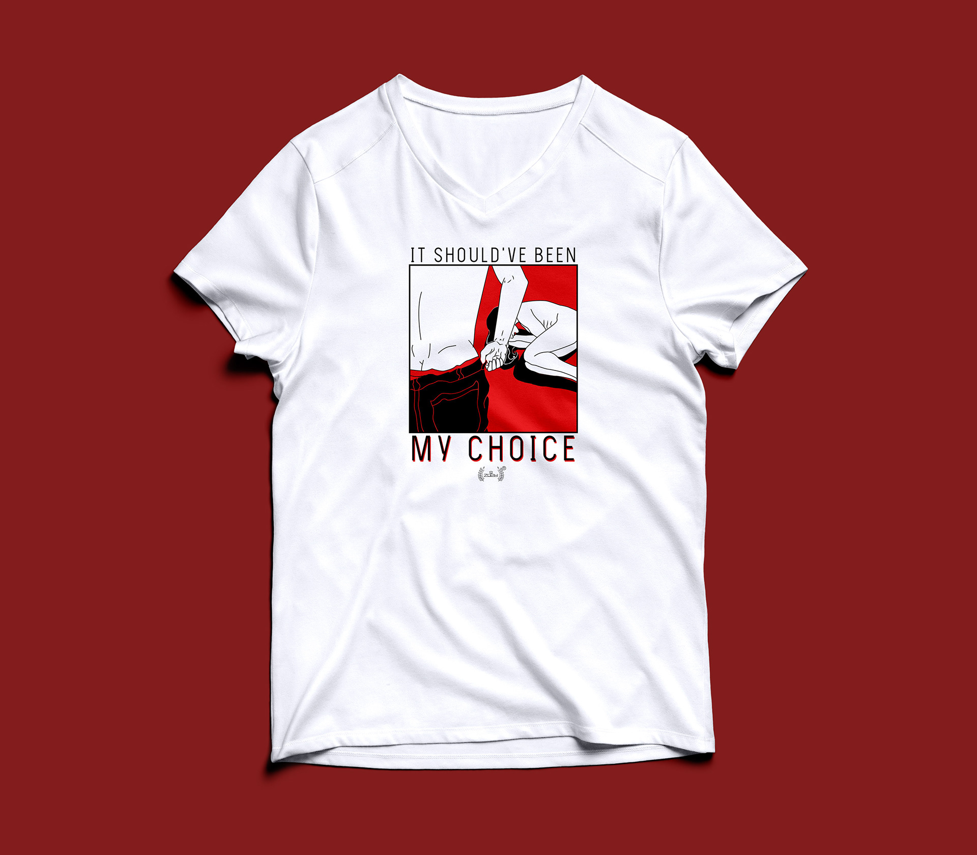
The illustration in "It should've been my choice" is a strong illustration in sight that seeks to generate impact both with the message to share and the color to use. In this case it is a representative illustration of a violation.

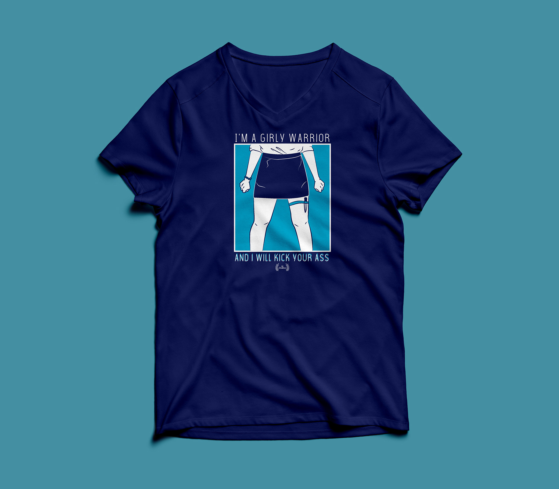
Both the blue version and the white version, this illustration generates a bit of feminine humor trying to represent the strength of women, and what they are capable of. This t-shirt was worked in two different color versions in order to test the target group, and analyze their response based on the colors that appeal to them the most when touching feminine themes. It was evaluated that both blue (a stereotyped as a masculine color), and the white t-shirt with the red wine illustration are liked since people base their interest more on the message that is shared and both colors represent strength in different ways.