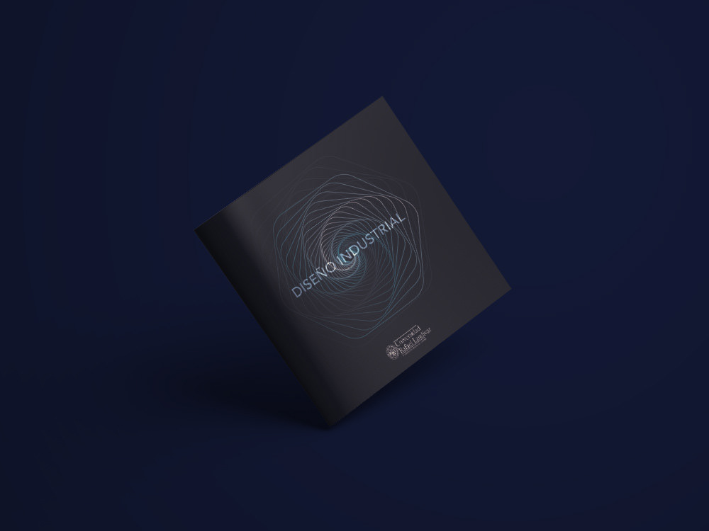
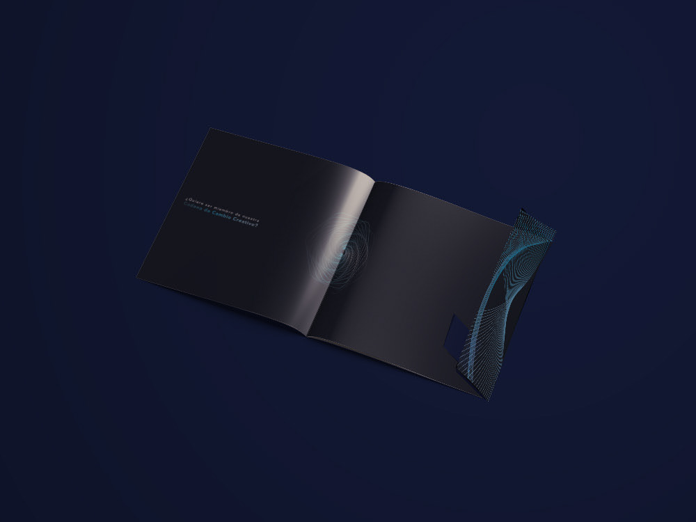
The entire graphic line was based on the Infinite Cycle of Innovation concept, thus creating infinite modules of lines with gradients to generate an optical illusion with them, and give the effect of infinity in a modern, minimalist and clean way.The cover is made up of the main module that gives illusion to both the cycle and infinity, giving the titlecentral theme that is Industrial Design. This cover was thought to be made of a material with a matte laminate with a varnish reserve in the title letters. The back cover handles the same module in a different way, leaving a different space in the format. Putting the university logo in the center at the bottom in a bigger way than on the cover.
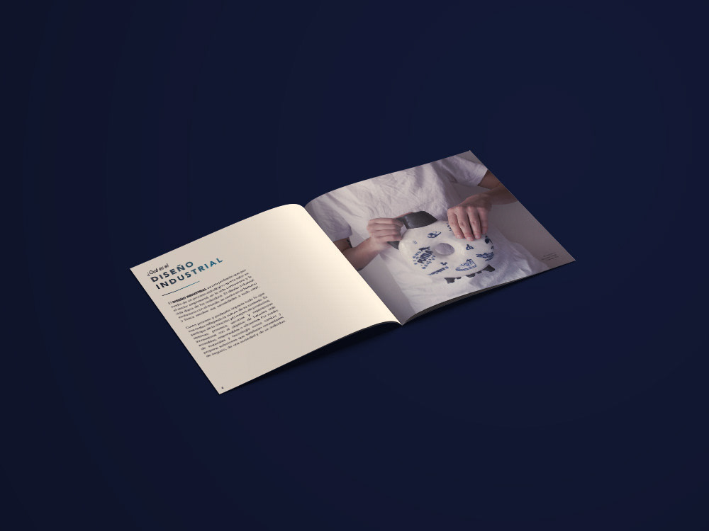
The layout throughout the fanzine has a clean and minimalist design, in order to generate an easy to understand visual hierarchy that is elegant and formal. The typefaces worked are those previously described, using the gradient in some titles and playing with the letter-to-letter spacing to create a hierarchy in titles, and using the body typeface in size 10 mostly, and 8 in the captions . The photographs were placed in large sizes and in studio quality to give elegance to the fanzine.
The color palette generally handles cool tones, two of the colors are dark to reflect seriousness, formality, and elegance. They are also colors that reflect technology, the lightest color in the color palette is representative of the Industrial Design department, this reflects innovation, creativity and gives more light to the graphic line along with white.
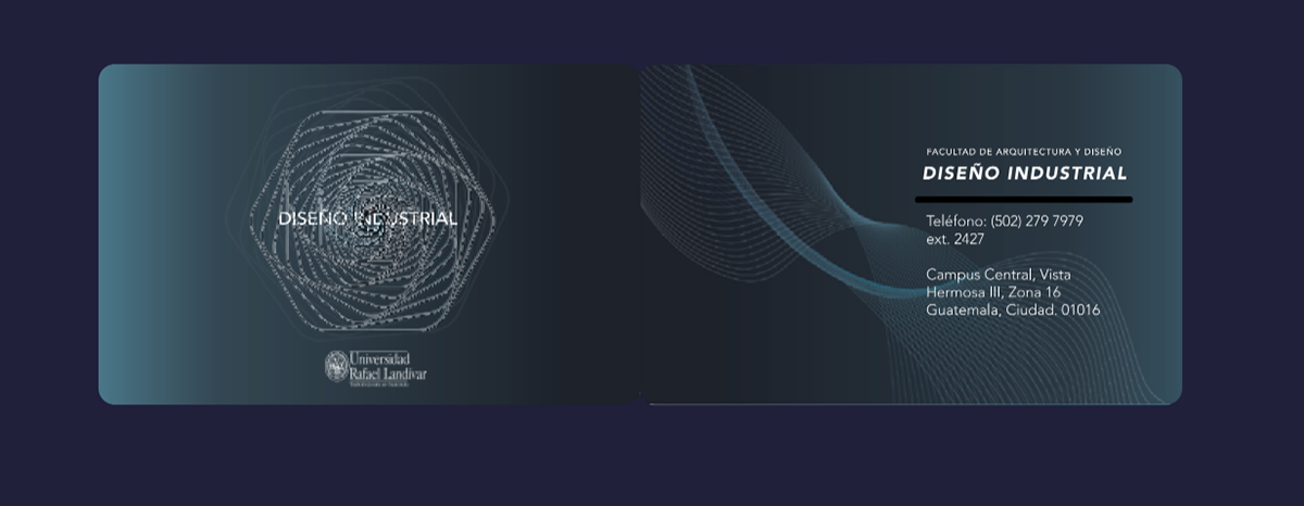
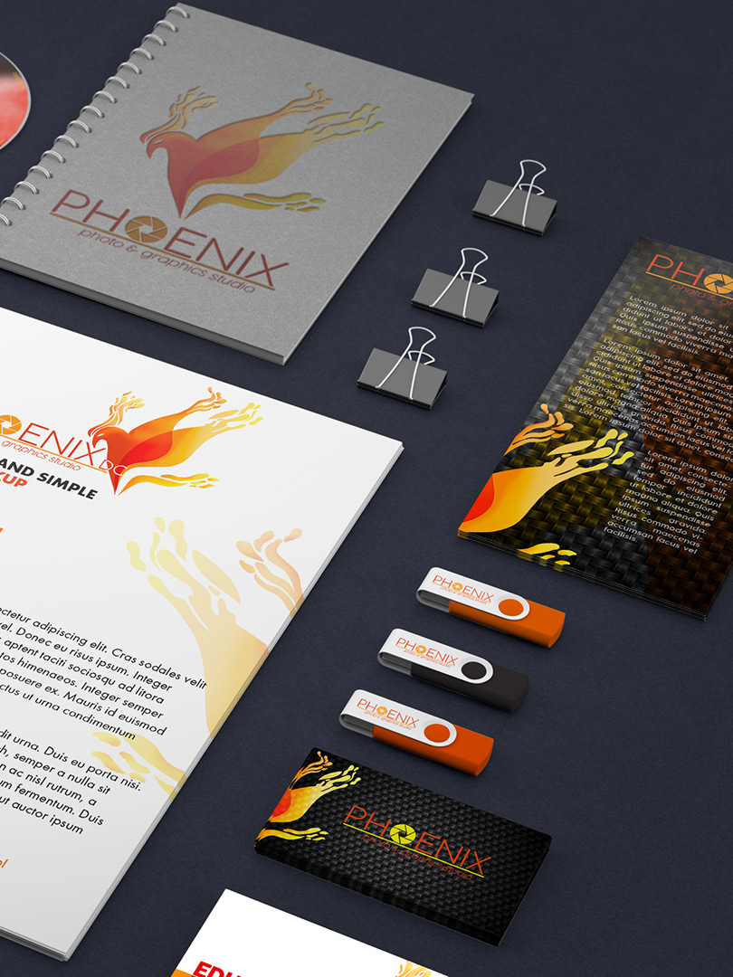
The business card design is simple, using the gradient that was worked on the other pieces, and the line modules. The information was decided to put on the back of the card. It is intended to have a silver foil finish on the main module and on the black line that separates the texts on the back.